
Your Time
Sometimes you just want to take a moment, relax, and breathe. Sometimes simple is all you need, no distractions, just you. Sometimes is today. Take Your time.
Taking the shot
The app they did not ask for
For my User Evaluation class, we were required to carry out a User test using any system we wanted, as long as it had both a Mobile and a Desktop version.
I implement my own system: a mindfulness app that helps with relaxation. It was made using Unity and runs on Mobile (android), Desktop (as a .exe), and Oculus Quest 2 VR headset.
Your Time
…my time? – Idea creation
Your Time is a Mindfulness app that gives users precisely that: mindfulness exercises. While doing the competitive analysis, I realized that many relaxation/mediation apps offer more than what users ask (gamification, getting challenged, storytelling…) Even though these can be great, sometimes you simply want to take a few moments to breathe.
The project included: idea creation, User Stories, Features definition, UI mockups in Figma, prototyping in Protopie, implementation in Unity, doing user testing (screening questionnaire, A\B testing, and UEQ), data analysis, and final report and presentation.
Wanna see how I made all of this happen? Join me on this journey!
Designing for Mobile, Desktop and VR
Yes, the three, at the same time!
I had defined that, for my user test, I was going to do A/B testing between Mobile, Desktop, and VR. Because of that, the interface needed to look as similar as it could on all of them.
Creating an interface that would look the same on three completely different devices was pretty challenging.
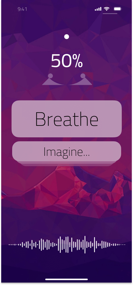
Even though some cute designs could have been made for a vertical mobile, this would not work at all on a desktop, nor in VR.
And I could not either take the full-on 360 that VR gives, because that would have been impossible in the other two devices.
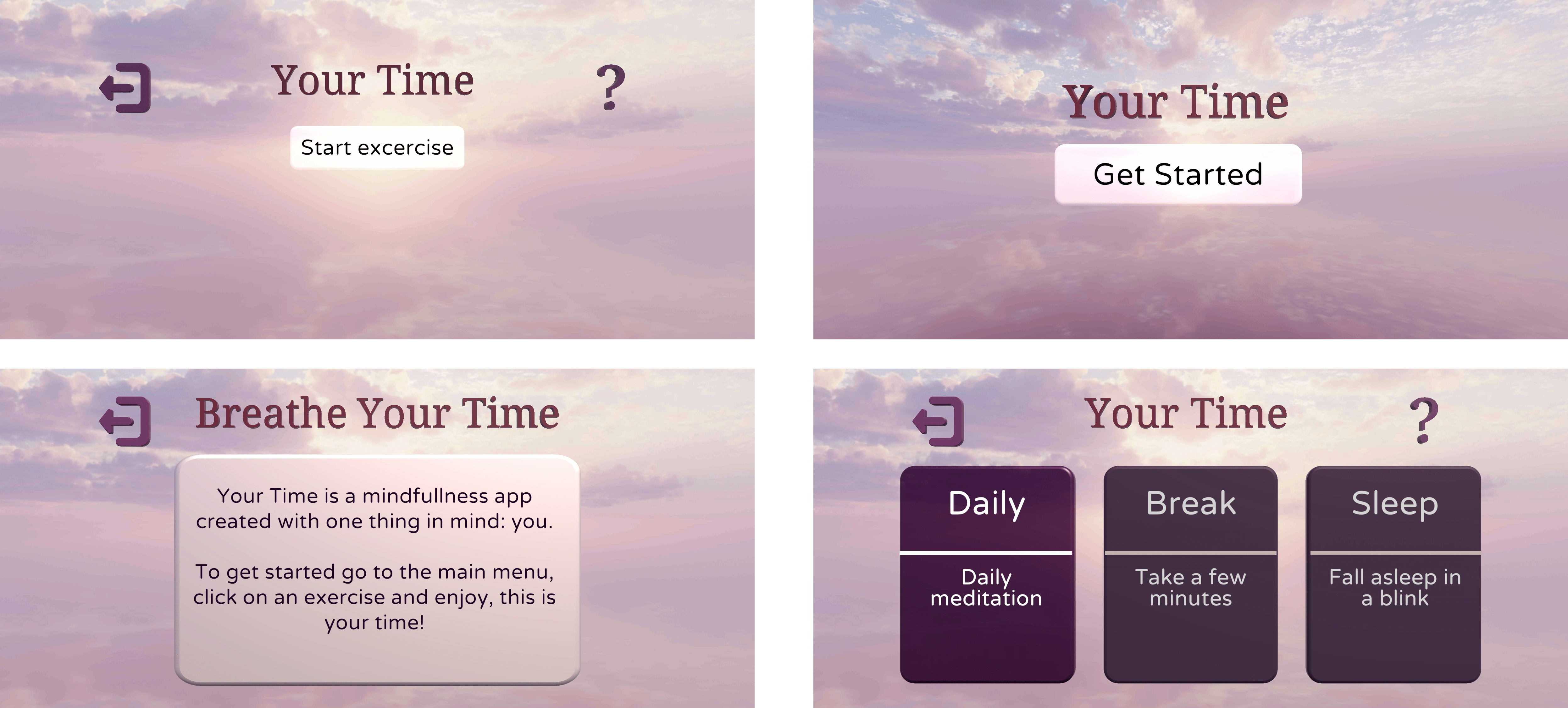
Designing the real deal
And how quick prototyping can be harder than polishing
Once the initial design was done, it was the moment of shipping to unity, because if I have learned something in my time developing VR is that, until you see in the headset, you can get the feel for it.
Final app
And a little bit about code…I cannot help myself!
The app consisted of 6 screens, from a splash screen to a menu to choose the exercise in, the exercise, and an about page. An extra screen is the star rating, where the user can give a rating from 1-5 to the exercise they just made.
Some of the code coolness were using Oculus Quest SDK to handle the interactions from the headset and Unity interaction toolkit to make getting input from Mobile and desktop easier.
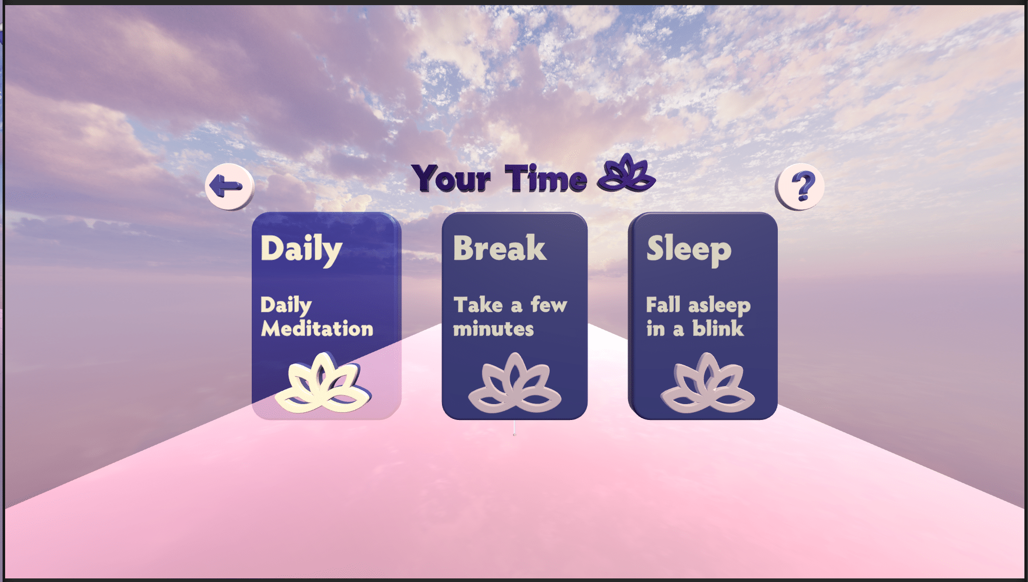
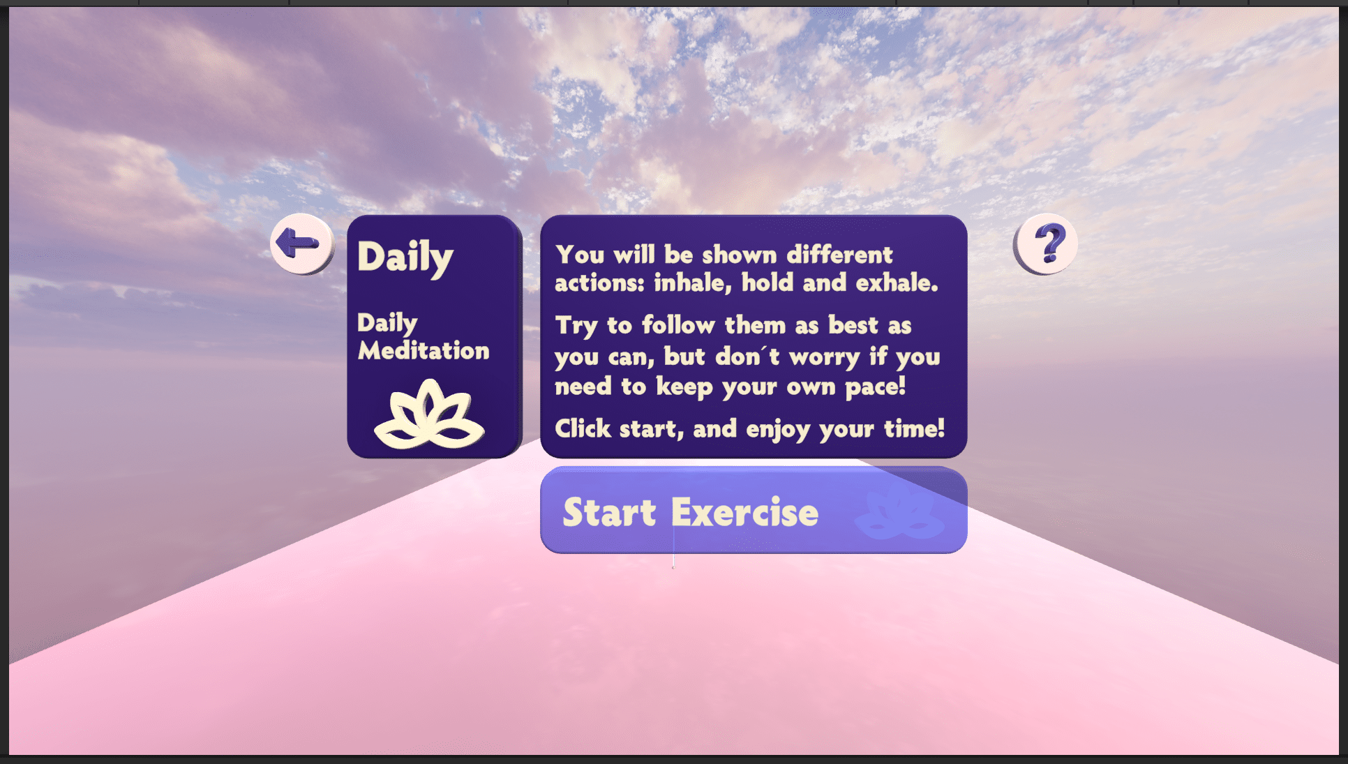
For the scene navigation, I implemented an App Handler as a static singleton that knows whether to go back or forth between scenes by hearing the events that buttons raise (following an observable pattern). This way, the logic of interacting with the buttons and the actual state handling of the app is decoupled, and one does not need to exist for the other to work.
Getting down to business
Time to get some testing done!
Now that the app was done, running in all Mobile (Android), Desktop and VR, it was time to get down to business: testing. After going back and forth with our teacher on what I actually wanted to test, I was able to come up with a workable hypothesis.
Continue reading to get the second part of this journey!
The nitty gritty
Hypothesis
The hypothesis I defined was that the device used impacts the user experience. This is something that we take for granted, people who have used VR, like me, know that it is way more engaging and that activities that would feel tedious otherwise are more enjoyable.
Nevertheless, I took this opportunity to really put this theory to the test, and so everything began.
Target group
The target users for the research were people who were acquainted with using Mobile, Desktop, and VR devices so that their experience with the usage would have as little impact on the outcome as possible.
Test subjects
We had 12 participants, ages 19-48. All of them were from México, were I carried out the testing.
6 of them would do C/A and 6 C/B, which meant that all of them would try VR (which was the baseline), but half and half would do Mobile and Desktop. I decided to do it that way because,
Protocol description
First, a screening survey addressed two main things: the person’s relationship with the devices and their habits related to Mindfulness and breathing exercises. This first one helped define whether their skills and the amount of interaction are enough to use our app without the usage being a blocker. And the second one will help us determine their disposition to carry out the exercises our system will ask them to perform.
Test
The user test consisted of an A|B testing with a pool of three different devices and a User Experience Questionnaire. Each device was mapped to the letter A = mobile, B = Desktop, and C = VR. People would only test two devices: either C|A or C|B. It was decided this way as C (VR) was the baseline.
Otherwise, each one of the participants would have needed to do the same breathing exercise 3 times, which would not only take way more time but also probably become tedious for them. In addition, the cross-testing would have gone from for combinations to 6 combinations, which would have meant needing more participants. That would have grown the scope.
Heuristics evaluation
Roasting my design, but I liked it
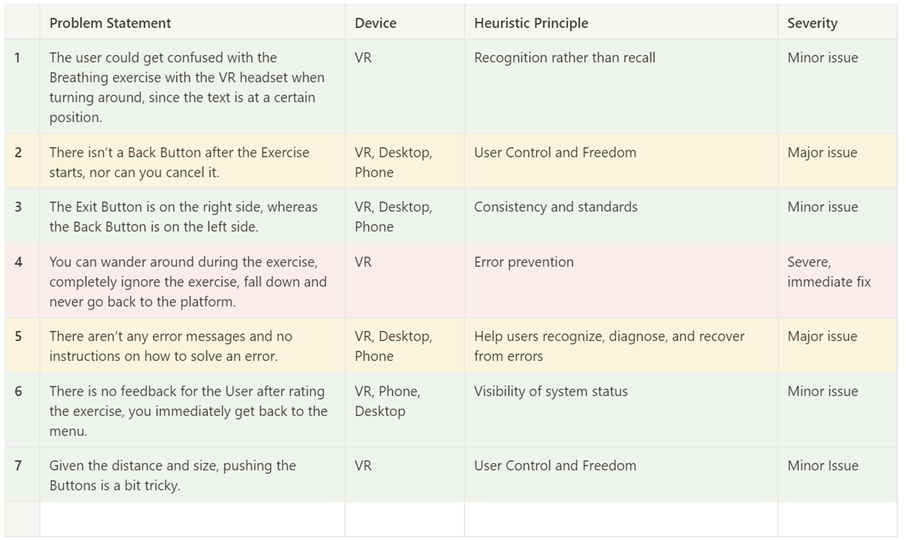
As part of the project, a heuristics evaluation needed to be done. Nevertheless, as I had created and implemented the design, it would have been weird if I had done heuristics. Hence, one of my classmates carried-out the first draft. After they had their baseline, I went through it with them, and it was really interesting seeing what they pointed out, especially considering the VR part.
I shared some of their thoughts (like how buttons are hard to click on VR, I had already even implemented some solutions to improve that). But others I had not considered (like the user falling from the floor in the VR world and not respawning back).
Testing duration analysis

VRMobile

VRDesktop

MobileVR

DesktopVR
The tables above show the differences between having Mobile or desktop as the first test and VR as the second. When compared, you can see that VR has a higher average duration rate in both, but there is a 35-second difference in Desktop and 115 in Mobile. This shows that, even though people still wanted to spend more time in VR in both, they wanted to spend even more time in VR after coming from a Desktop Test. It can be interpreted as people enjoying the Desktop experience more and not needing as much time in VR to compensate.
Interestingly, there is not much of a difference in how much time people spend using either Mobile or Desktop after using VR. As in both cases, there was only a 1.3 seconds difference in the average time reduction of around 100 after using VR.
User Experience Questionnaire
What the data showed
The questionnaire we used focuses on determining six main variables: Attractiveness, Perspicuity, Efficiency, Dependability, Stimulation, and Novelty. You can look at the meaning here <>. To analyze the results, I took the mean and the variance of the UEQ for every device in every test order. I also got the UEQ results for all the tests, all the devices in Test 1, and all the devices in Test 2.
As mentioned in the UEQ analysis worksheet: Values between -0.8 and 0.8 represent a more or less neutral evaluation of the corresponding scale, values > 0,8 represent a positive evaluation, and values < -0,8 represent a negative evaluation.
And, based on that, our overall system got amazing results! With a low of 1.08 in Novelty and a high of 2.44 in Perspicuity. If we look at the overall results of all the devices, there is no important difference between how they performed based on whether they were used in Test one or two. Nevertheless, the situation changes when we see the nuances between the devices.
Novelty
VR performed way better than the other two devices in Novelty (if the product’s design is creative and catches the user’s interest), where there is an increment from 0.42 in Mobile, to 0.92 in Desktop, to 1.5 in VR. Some of our user’s thoughts reinforce it:
“The concept is really good, as it innovates in something that for some cultures is key (meditation), and it manages to make it more interesting for the newer generations.”
Attractiveness
It also outperformed in Attractiveness (1.5 Mobile, 2.0 Desktop, 2.11 VR) and Stimulation (1.17 Mobile, 1.17 Desktop, 1.42 VR). And some of our testers said amazing things about it!
“I loved the 3dness and the transparency in the menus. I loved how the logos looked and how you could see the landscape.”
It felt very immersive and the colors chosen had a very good effect in relaxing and calming the user
Perspicuity
VR was way lower than both Mobile and Desktop in Perspicuity (which is how easy it is to get familiar with the product and how easy it is to learn it) with a 0.56 point difference. Where mobile had 2.54, Desktop had 2.79, and VR had 2.23. Even though these results are not negative, they do show what was expected: VR is more difficult to get acquainted with. And we can confirm that with some of our user’s thoughts:
“Might need to improve the clarity on how to control and move through the app”
“Something I would change is having to change camera direction at the beginning of the test. Those who are not used to VR may find it difficult.”
Dependability
VR had the biggest point difference on dependability, with 0,6 lower than desktop (does the user feel in control of the interaction? Is it secure and predictable?), with a 2.25 vs. 1.65 points (mobile had 1.57). This can be concerning, as in VR, you quite literally have control of the situation. And, even though it still had a good result, it is still lower. The reason might be related to issues found in the heuristics analysis and by the users related to the VR interactions.
One of these is that if you wandered around the space in VR, a) you could fall from the platform, and b) there was no respawning. This was marked as a problem needing an immediate fix, even more as our users spotted it.
“I would have liked most to be able to walk around the scenery without falling down.”
If you fall of the platform you are done
Stimulation
Interestingly, Mobile and Dekstop had the same.142 Stimulation result (Is using the product exciting and motivating? Is it fun?) While VR had 1.42. Even though it was not the greatest positive difference that VR had, it is still important noting, as one of the most important things that I wanted to find out was if people would be more motivated to do a breathing exercise if they were to use VR for it. And it got confirmed; they would! Some even went so far in mentioning that they would continue to use the app to continue to have the feeling of being immersed in VR!
Efficiency
Finally, despite VR being lower in efficiency (Can users solve their task without unnecessary effort? Does it react fast?), it had the lowest difference of 0.21. It can definitely be related to, for example, one of the problems found on the heuristics test. In VR, it can be difficult to interact with objects further away. Pressing on the “close” or “about” buttons is way easier on the phone, where you can see your fingers next to the device, compared with far away icons on VR.
Even though I had already tried to address this when developing the app by making the icons have a background that was also clickable, it seems that further improvement would need to be done to make the experience better for users.
Notes in immersion
All of these tests arose because I was interested in how immersion changes from device to device. Nevertheless, immersion is hard to measure, and researchers are still trying to comprehend concepts. Because of that reason, immersion was not the main focus of the study. Nevertheless, some user comments mention this sensation of feeling immersed in the experience.
“I loved how I felt like the particles were air. Whenever they came towards me, I felt I was breathing them; whenever they went out, I felt they were leaving my body. I did not have that sensation on the phone…I was transported to another world. I loved it.”
“The interface is really good. It makes me want to keep doing the exercises to stay immersed in the VR. “
It would be interesting to carry out research on immersive devices are, and if this immersion can, for example, produce better relaxation outcomes for breathing exercises.
Final thoughts
On the development side, doing this project was a fantastic challenge nobody asked me to tackle, which was a double-edge-sword. Developing my own system was great, as it gave me what I thought was a small-scoped end-to-end project I could implement in Unity.
Nevertheless, it turned out to be way more challenging than I expected (as making the same app run on three devices was no joke). Which was amazing, as I learned a lot, but definitely overflow the allocated time I had given it.
On the actual project side (carrying-out research), it was great! I discovered the amazing world of research and User Experience and got to see first-hand how Hypotheses evolve, testing is done, and analysis is made.